Materials, Imagery & Technique

Mamaandaawizi, He performs wonders: Anishinabemowin discourses of art, artist, image, and colour
by Alan Corbiere

Renewing Anishinaabe Arts: Norval Morrisseau and the Deep Tradition
by Ruth Phillips

Materialism and Meaning in Morrisseau’s Wiigwaasabak
by Christopher T. Green

The Story of the Conservation of a Birchbark Artwork
by Jill Plitnikas, Marie- Helene Nadeau, Jessie Richard

What Big Teeth You Have Grandfather: Trauma and Rage in Art of Norval Morrisseau
by Richard Hill

A New Visual Language: Experimentation and Creativity (1955-1969)
by Carmen Robertson

Experimentation from the 1970s through 1985
by Carmen Robertson

The Blues: The Spiritual Erotic Fantasies of Norval Morrisseau in Technicolour
by Michelle McGeough
The Conservation of a Birchbark Artwork
by Jessie Richard, Jill Plitnikas, and Marie-Hélène Nadeau
Preface: From Our Beginning
The story of an untitled Norval Morrisseau painting from about 1960 doesn’t start at a museum. Once mistakenly assumed to be a piece of rolled up birchbark, and not a painting at all, it traveled more than 4,270 kilometres across Canada before it was put on display in its permanent home. From a grocery store in Beardmore, Ontario, to the Kay-Nah-Chi-Wah-Nung Historical Centre, also known as Manitou Mounds at the Rainy River First Nation, its journey was a bumpy one.
Recently, I had the pleasure of meeting George and Diane Glowasky, the donors of the Morrisseau painting, who shared the incredible story of how their family came to trade groceries for an artwork by Norval Morrisseau. In the 1960s, George’s parents—Anne and Tony—owned Shop Rite Grocery and Quality Meat in Beardmore. Morrisseau lived in a small, one-room house just outside of town, so tiny that he would often paint outside on the grass, leaving his works to dry there. George recalls his mother telling him how Morrisseau would frequently visit the store to sell his paintings. On one occasion, he wrote a letter to Anne proposing a trade: groceries for an original piece of art. In response, Anne arranged for groceries to be delivered to Morrisseau, without expecting anything in return. Weeks later, however, he returned to the store with a painting, telling her, “Someday, this will be valuable.” Anne held on to the letter for years, until it was accidentally discarded.
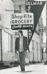
Norval Morrisseau at Beardmore grocery store.
After the painting left the grocery store in Beardmore, the work moved between various family members’ homes before ending up in Anne and Tony’s basement. In the years that followed, George and Diane discovered the painting hidden behind the furnace. It was cracked and dusty, but they decided to bring it home with them. Unsure of what to do with it, they stored it in their basement, wrapped in a quilt. Finally, around 2015, the couple decided to donate the work to the Kay-Nah-Chi-Wah-Nung Historical Centre, where it was received by then manager Keith Hamilton.
The artwork’s journey did not stop there. After the work arrived, it was placed among other artifacts in the museum, assumed to be rolled-up birchbark rather than a painting. Trying to decide what to do with it, a museum staff member reached out to community members and consulted with Elder Willie Wilson. After examining the piece, Wilson advised that it be placed outside in the forest in keeping with the cultural significance of birchbark. The painting was placed in a basket with other pieces to be returned to the land in the spring. Fortunately, in 2016, Hamilton, who had since left the centre, stopped by for a visit. “Oh,” he said on seeing the roll of birchbark, “you found the Morrisseau!”
The painting was in rough shape but worth preserving. The staff, along with community members from Rainy River First Nation, decided to send the artwork to the Canadian Conservation Institute in Ottawa for treatment and repair. After it was restored and framed, it would travel back to the museum to assume its place in our collection.
When I joined the museum in 2022, the artwork was already in Ottawa, where it had been for some time. When I first met conservator Jill Plitnikas via a video call, we discussed the challenges facing her team in conserving the birchbark. We couldn’t assume Morrisseau’s intentions with the work, nor could we know what was missing from sections that had broken off. Most important, we discussed the artwork’s profound significance to the Glowasky family, the community, and the art world. Jill and her team kept me informed every step of the way, sharing images, and even allowing me to visit while I was in Ottawa for a conference. This artwork certainly received VIP treatment.
When we talk about indigenizing or decolonizing a space, I often reflect on this experience. I think about Morrisseau and how he would feel, watching all these incredibly talented scientists and conservators work to preserve his art for future generations. I imagine his family standing proudly, seeing his work being admired by so many. And, while few believed in him during the 1960s, Morrisseau was right: “Someday, this will be valuable.”
––Jessie Richard, Curator, Kay-Nah-Chi-Wah-Nung Historical Centre
Filling in the Blanks: How We Treated the Losses in a Morrisseau Artwork
This early artwork on birchbark (Untitled, c.1960) by Norval Morrisseau is in the collection of Kay-Nah-Chi-Wah-Nung Historical Centre at Rainy River First Nation. The work portrays a representation of a bird on three birchbark panels. The design was created by peeling the top layer of bark to reveal the lighter one underneath and applying oil paint. The centre wanted the artwork to be studied and enjoyed for as long as possible, through exhibition and loan, but unfortunately, the structural issues of the artwork when it was acquired––the curling and fractured bark, detached pieces, and significant losses––prohibited this. To meet these goals, they applied to have the artwork conserved at the Canadian Conservation Institute in Ottawa.
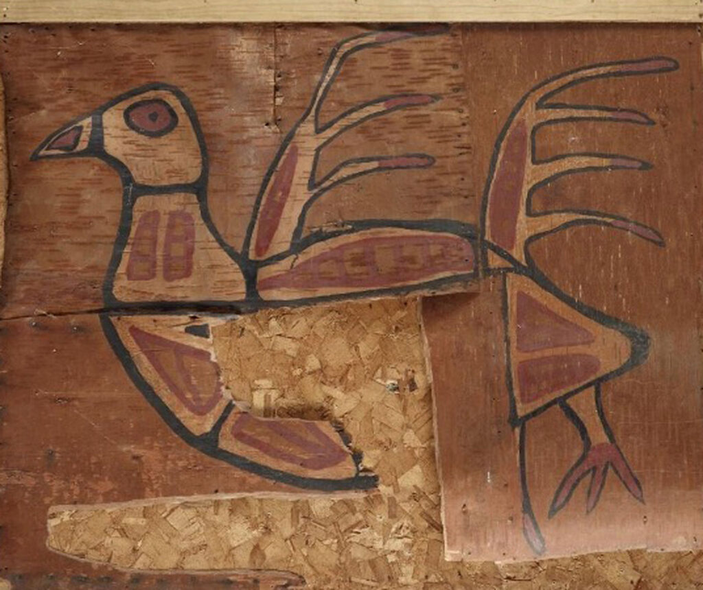
Norval Morrisseau, Untitled, c.1960, acrylic on birchbark, dimensionsTK, Kay-Nah-Chi-Wah-Nung Historical Centre, Rainy River First Nation. The untitled birchbark artwork before treatment by the Canadian Conservation Institute.
The centre and the institute agreed on an extensive treatment plan by objects conservator Jill Plitnikas to improve the artwork’s physical stability and legibility. Plitnikas reshaped the bark, stabilized delamination and splits, and re-attached broken fragments, after which came the final step of adding material to fill missing sections of the birchbark. For this treatment stage, referred to as loss compensation, Plitnikas collaborated with paintings conservator Marie-Hélène Nadeau, who was responsible for toning (that is, colouring) the filled areas. The Canadian Association for Conservation of Cultural Property (CAC) Code of Ethics and Guidance for Practice provided a framework for planning and carrying out the loss compensation as well as the preceding treatment stages. These professional standards address all aspects of conservation work from assessment to implementation. Following them helps to ensure that interventions have been fully evaluated by conservators, caretakers, rights holders, and other stakeholders before actions are carried out.
Considerations
The first issue was whether filling would be of benefit. Also known as loss compensation, filling stabilizes the structure of the artwork and helps restore the intended aesthetic. Fills would counteract the force of the curling bark, which, if left untreated, could continue to cause distortion, splitting, delamination, and loss of media. The two largest sections of the missing painting occur within the bird design, so fill material would have a notable visual impact in addition to counteracting the force of the curling bark. Both losses also revealed sections of underlying panels, which were not originally visible.
The next questions concerned the materials, structure, and appearance of the fills, including their chemical, physical and visual properties. The materials used for the fills should be chemically inert; otherwise, they could accelerate the breakdown of the bark. They should also be similar in weight and strength to the birchbark. A fill that is too heavy could create physical stress on the bark and if it is too strong, it could cause the surrounding material to break if physical force were applied. The fills must be securely attached to the edges of the bark, but also reversible, so that if they need to be removed in the future (for retreatment, perhaps) it will be possible with minimal effect on the artwork.
The main visual considerations for the fills were, as mentioned, the central location of the two largest losses and the significant size of one of them. Others were the thickness, rigidity, surface texture, and topography of the birchbark substrate, as well as the colour and gloss of both it and the original paint. The absence of any known photographic record of the artwork affected how completely the original design could be recreated.
Loss Compensation
Key to creating the fills was the research and testing of materials and methods, alongside consultations with Kay-Nah-Chi-Wah-Nung staff and conservation colleagues at the institute. This was vital for making important decisions such as how imitative of the original artwork the appearance of the fills should be.
After consultations and researching different fill materials, Plitnikas identified paper as the best choice because it possesses chemical properties similar to birchbark. Another advantage is it does not tend to curl badly therefore it would not add additional physical stress to the panels. As well, its sheet format and the variety of weights allowed for the fabrication of fills with a similar structure, thickness and rigidity to the panels. Additionally, a range of adhesives can be used with paper that are chemically compatible with bark and will create a secure, but reversible, join. Paper is also easy to shape, making it easy to match the curvature of the panel edges. Lastly, it comes in a variety of textures, which can be close in appearance to bark. Plitnikas investigated the properties of different papers and adhesives by creating physical mock-ups.
Nadeau selected acrylic paint to tone the paper because it can produce saturated, opaque colours, and it can replicate the matte quality of the birchbark’s surface. This paint can be applied using an airbrush, a technique that leaves no brushstrokes and can achieve subtle gradations of colour. In addition, compared to other media used for toning paper or applied with an airbrush, acrylics offer better long-term stability, particularly in terms of lightfastness. Nadeau tested different colour combinations and paper substrates to develop the best working methodology.
Consultation between Jill Plitnikas (senior objects conservator and project lead) and Marie-Hélène Nadeau (paintings conservator), undated, photographer unknown.
Assisted by conservation colleagues and staff at the Kay-Nah-Chi-Wah-Nung Historical Centre, Plitnikas and Nadeau explored different options for the appearance of the fills. They also shared photographs of physical mock-ups and the fills in progress, along with software-created images, with the centre. Virtual meetings to view the artwork and mock-ups also helped gather the staff’s spontaneous reactions despite the long distance between Rainy River and Ottawa. To aid with the toning, the staff in Ottawa and Rainy River referred to what was termed a visual compensation spectrum. At one end was a minimalist approach, which used a single hue for all the toning; at the other, a mimetic approach, which fully recreated the colour and design. The goal was to find the best option on the spectrum.
Plitnikas, Nadeau, and Kay-Nah-Chi-Wah-Nung staff agreed to take a more minimalist approach. The areas of loss are less distracting but still discernible to the viewer in ways that importantly acknowledge the artwork’s original aesthetic intention, as well as the changes that had occurred over time. The centre plans to include didactic material alongside the artwork when displayed to explain the choices behind the intervention.
The fills were constructed to be similar in thickness and rigidity to the birchbark substrate by adhering layers of hand-cut Japanese paper to serve as the body with a top layer of hand- or laser-cut watercolour paper. The surfaces were contoured to complement the overall uneven topography of the bark, and the edges shaped to match the downward curl of the bark panel’s edge. Physical features of the birchbark surface like lenticels (pores) and lifting layers, however, were not replicated in the fills.
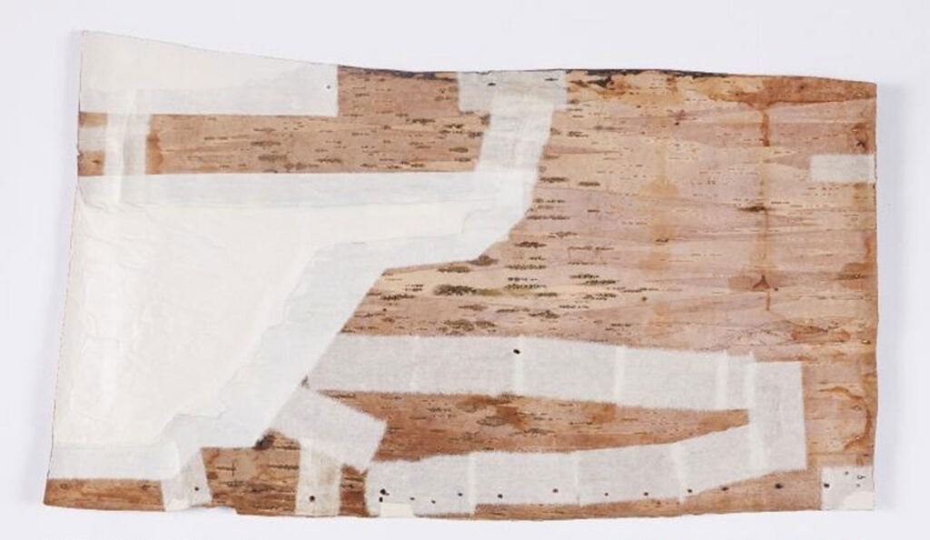
During treatment: Japanese paper backings of fills (and along joins of re-attached fragments).
The hues of the fills were chosen to integrate the aesthetic of the bird design and bark substrate. Homogeneous brown hues, used for smaller fills, were individually matched to the colour of the bark surrounding them. To complement the wide range of brown hues surrounding the fill at the proper left top corner of the panel, a slight gradation of colour was used across its surface. The largest fill was toned with lighter brown hues, which emulated those observed in the body of the bird and then subtly transitioned to darker ones that matched the colour of the surrounding bark. This shift in hue helps the viewer differentiate the main elements of the composition without introducing subjective interpretation.
Loss compensation was one of the final steps in the conservation treatment of this birchbark artwork by Norval Morrisseau. Like the earlier treatment steps, namely reshaping the bark and re-attaching fragments, filling the losses addressed both structural and aesthetic issues. The artwork can now be displayed, as well as loaned to other organizations, for years to come. The conservation project reestablished the original form and aesthetic of Morrisseau’s artwork by creating a final appearance that aimed to complement, rather than replicate, the texture and colours of the bird design and bark substrate.
––Jill Plitnikas, ACR, Senior Objects Conservator and Marie-Hélène Nadeau, Paintings and Polychrome Surfaces Conservator, Canadian Conservation Institute, Department of Canadian Heritage
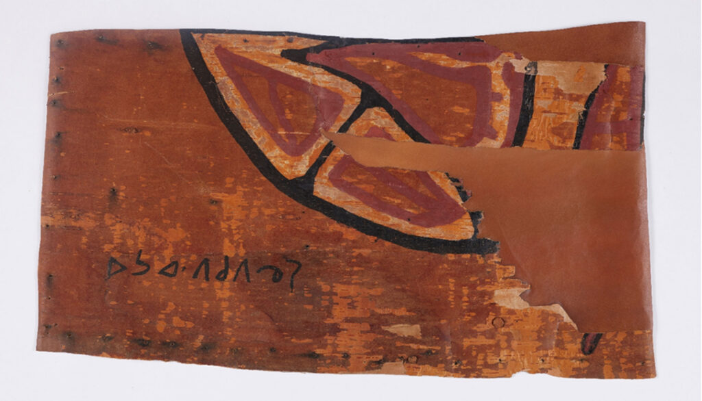
After treatment, Normal light, panel 2.